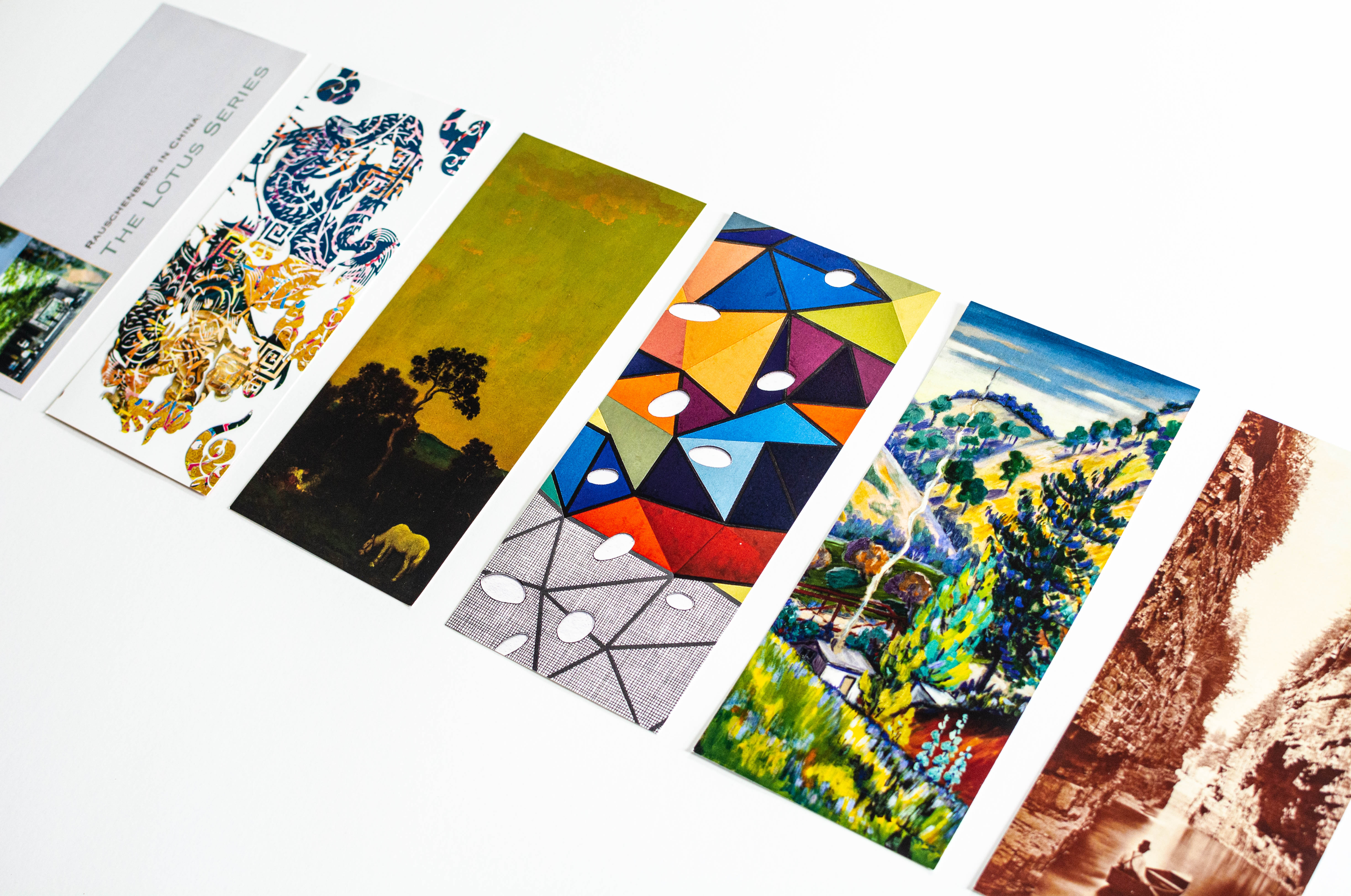
Card fronts feature artwork relevant to each exhibition.
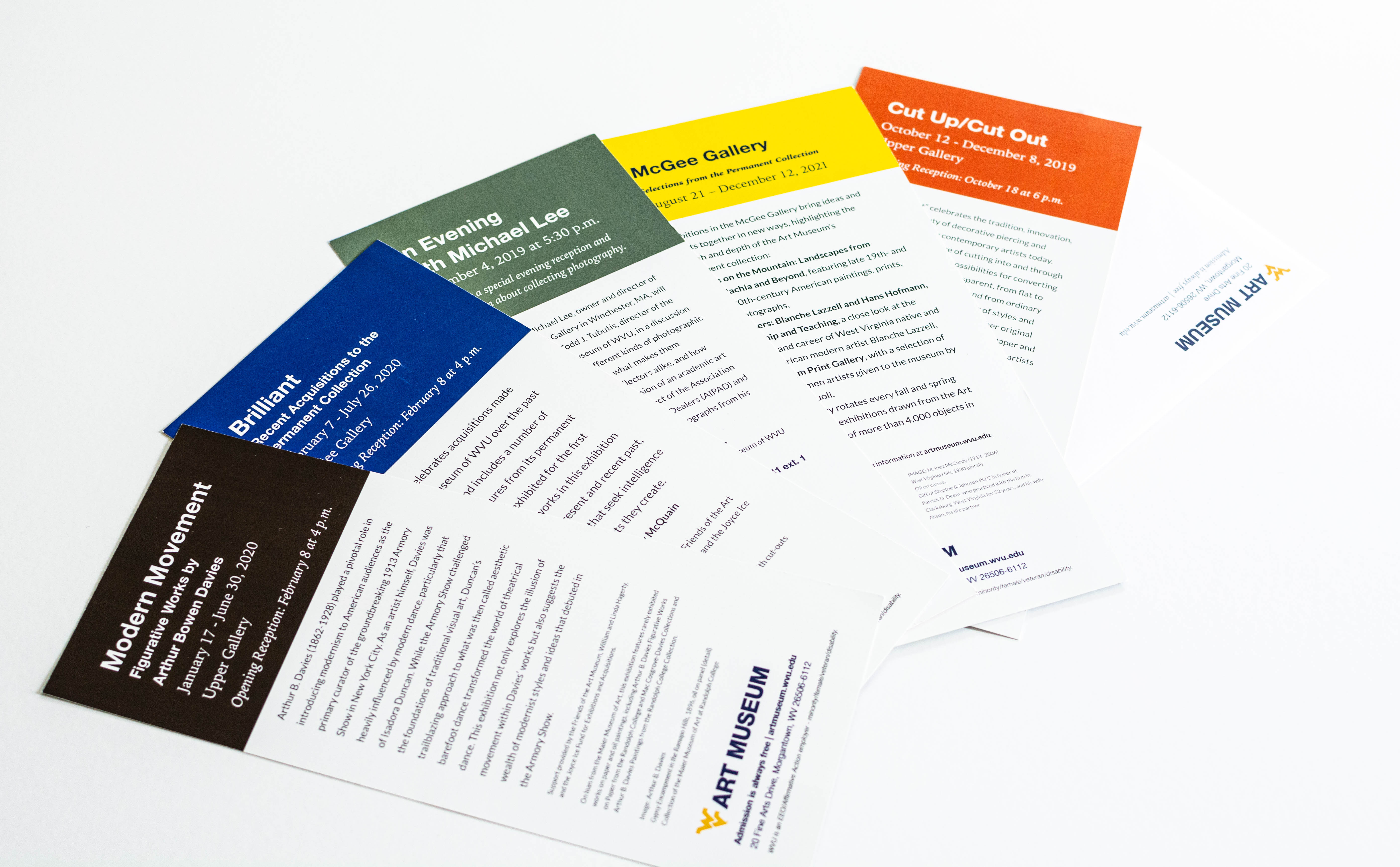
Card backs use a color-blocked header in a brand color to complement the artwork on the front of the card.
Exhibition Card Design and Branding
Branding & Print Design
I took cues from the main West Virginia University brand and utilized brand colors and fonts to create a sub-brand for Art Museum of WVU exhibition marketing pieces that suggests a feeling of continuity and storytelling.
The back of each card features a color-blocked header in a brand color that complements the full-bleed artwork on the front of the card. In the case that images are not allowed to be full-bleed contractually, I use brand colors to complement the artwork on that side as well.
Readers and friends of the museum can expect to receive cards in singles or multiples inside of a business envelope or find them on display as rack cards at the Canady Creative Arts Center and Museum Education Center.
My Role:
Art direction
Branding
Visual and layout design
Image editing
Typography and typesetting
My Team:
Art Museum of WVU (Content, Images, Approval)
University Relations Design (University Brand Standards)